基础知识
因为CSS主要是对页面元素的美化,所以需要先学习 HTML相关课程。
大部分HTML元素都有系统提供的样式,但有以下问题
- 不同浏览器显示样式不一致
- 样式过于简单,显示效果不美观
- 很难按照设计稿完全呈现显示效果
样式声明
可以通过多种方式定义样式表。
外部样式
使用 link 标签引入外部样式文件,需要注意以下几点。
- link 标签放在
head标签内部 - 样式文件要以
.css为扩展名 - 一个页面往往需要引入多个样式文件
1 | 属性 说明 |
》》》 link 还有其他属性会在其他章节单独讲解
1 | <link rel="stylesheet" href="houdunren.css" type="text/css"> |
嵌入样式
使用 style 标签可以在文档内部定义样式规则。
1 | <style> |
内联样式
可以为某个标签单独设置样式。
1 | <h1 style="color:green;">houdunren.com</h1> |
导入样式
使用 @import 可以在原样式规则中导入其他样式表,可以在外部样式、style 标签中使用。
可以使用以下两种方式导入
1 | @import "hd.css" |
导入样式要放在样式规则前面定义。
1 | <style> |
其他细节
空白
在样式规则中可以随意使用空白,空白只是看不见但同样占用空间,所以可以结合其他工具如 webpack 等将 css压缩为一行。
注释
注释是对定义样式规则的说明,便于后期维护理解。
1 | ... |
错误
样式规则如果存在错误,解析器会选择忽略,并不会影响其他样式规则。
以下代码的 houdunren:red 是无效样式但不影响后面的 font-size:100px; 规则使用。
1 | h1 { |
初始样式
有些标签默认含有内外边距,且不同浏览器大小也不一样。为了统一我们可以重置标签的CSS默认样式。
最简单的方式就是使用插件css-reset (opens new window)完成,你也可以在vscode等编辑器中定义代码片段。
1 | <link rel="stylesheet" href="https://cdnjs.cloudflare.com/ajax/libs/meyer-reset/2.0/reset.min.css" /> |
选择器
2021-02-04 18:00:54
样式是做用在元素标签上的,通过本章将可以随意查找元素来应用样式。
基本选择器
1 | 选择器 示例 描述 |
标签选择
使用 * 可为所有元素设置样式。
1 | * { |
根据标签为元素设置样式
1 | h1 { |
同时设置多个元素组合
1 | h1,h2 { |
元素在多个组件中存在
1 | h1,h2 { |
类选择器
类选择器是为一类状态声明样式规则,下面是把文本居中定义为类样式。
1 | <style> |
将类选择器指定为具体标签
1 | .help-block { |
ID选择器
为有 id 属性的元素设置样式
1 | #container { |
文档中ID应该是唯一的,虽然为多个元素设置同一个ID也可以产生样式效果,但这是不符合规范的。
建议优先使用类选择器
结构选择器
1 | 选择器 示例 描述 |
后代选择器
HTML中元素是以父子级、兄弟关系存在的。后代选择器指元素后的元素(不只是子元素,是后代元素)。
1 | main article h2,main h1 { |
子元素选择
子元素选择器中选择子元素,不包括孙级及以下元素。
1 | main article>h2 { |
紧邻兄弟元素
用于选择紧挨着的同级兄弟元素。
1 | main article+h2 { |
后面兄弟元素
用于选择后面的所有兄弟元素。
1 | main article~* { |
属性选择器
根据属性来为元素设置样式也是常用的场景。
1 | 选择器 示例 描述 |
为具有 class 属性的h1标签设置样式
1 | h1[class] { |
约束多个属性
1 | h1[class][id] { |
具体属性值设置样式
1 | a[href="https://www.houdunren.com"] { |
^ 以指定值开头的元素
1 | h2[name^="hdcms"] { |
$ 以指定值结尾的元素
1 | <h2 name="houdunren">houdunren.com</h2> |
* 属性内部任何位置出现值的元素
1 | h2[name*="houdunren"] { |
~ 属性值中包含指定词汇的元素
1 | h2[name~="houdunren"] { |
| 以指定值开头或以属性连接破折号的元素
1 | h2[name|="houdunren"] { |
伪类选择器
为元素的不同状态或不确定存在的元素设置样式规则。
1 | 状态 示例 说明 |
:超链接伪类
定义链接的不同状态
1 | a:link { |
不只是链接可以使用伪类,其他元素也可以使用。下面是对表单的点击与获取焦点状态的样式设置。
1 | input:focus { |
:target
用于控制具有锚点目标元素的样式
1 | div { |
:root
根元素选择伪类即选择html
1 | :root { |
:empty
没有内容和空白的元素。下面第一个p标签会产生样式,第二个不会因为有空白内容
1 | :empty { |
结构伪类
下面来通过结构伪类选择器选择树状结构中的标签元素。
:first-child
选择元素中 span 标签并且是第一个。
1 | article span:first-child { |
:first-of-type
选择类型是 span 的第一个元素
1 | article span:first-of-type { |
:last-child
选择元素中 span 标签并且是最后一个。
1 | article span:last-child { |
:last-of-type
选择类型为 span 的最后一个元素
1 | article span:last-of-type { |
:only-child
选择是唯一子元素的 span 标签
1 | article span:only-child { |
:only-of-type
选择同级中类型是 span 的唯一子元素
1 | article span:only-of-type { |
:nth-child(n)
选择第二个元素并且是span标签的
1 | article span:nth-child(2) { |
:nth-of-type(n)
选择第二个 span 元素,不管中间的其他元素
1 | article span:nth-of-child(2) { |
计算数量
n为0/1/2/3… ,下面是隔列变色
1 | table tr>td:nth-child(2n+1) { |
从第三个开始设置样式
1 | table tr>td:nth-child(n+3) { |
设置前三个元素
1 | table tr>td:nth-child(-n+3) { |
奇数元素
选择奇数单元格
1 | table tr>td:nth-child(odd) { |
偶数元素
选择偶数单元格
1 | table tr>td:nth-child(even) { |
:nth-last-child(n)
从最后一个元素开始获取
1 | table tr>td:nth-last-child(2n+1){ |
取最后两个元素
1 | main>ul li:nth-last-child(-n+2) { |
:nth-last-of-type(n)
从最后一个元素开始选择 span 标签 。
1 | article span:nth-last-of-type(1) { |
:not(selector)
排除第一个li元素
1 | ul li:not(:nth-child(1)) { |
表单伪类
1 | 选择器 示例 说明 |
表单属性样式
1 | input:enabled { |
表单必选样式
1 | input:required { |
表单验证样式
1 | input:valid { |
字符伪类
1 | 状态 示例 说明 |
首字母大写
1 | p::first-line { |
段落首行处理
1 | p::first-letter { |
在元素前添加
1 | span::before { |
搜索框示例
1 | div { |
添加属性内容
1 | h2::before { |
元素权重
2021-02-04 18:30:42
元素会被多个样式一层层作用,这就是层叠样式表的来源。如果多个样式做用在元素上就会产生优先级权重问题。
使用类、ID、伪类都有不同的权重,具体应用哪条规则要看权限大小。
- 相同权重的规则应用最后出现的
- 可以使用
!important强制提升某个规则的权限
权重应用
1 | 规则 粒度 |
下面是ID权限大于CLASS的示例
1 | <style> |
属性权重的示例
1 | <style> |
行级权重优先级最高
1 | <style> |
强制优先级
有时在规则冲突时,为了让某个规则强制有效可以使用 !important
1 | <style> |
两条规则权限一样,默认应用第二个规则,但第一个规则使用了 !important 提升了权限,所以被应用。
LESS
为了使 CSS 更易维护和扩展,并减少在书写规则时对权重的思考,使用LESS是不错的主意。
很多软件提供了自动生成LESS的功能,下面是在VSCODE中使用的方法。
- 安装插件
easy-less编译LESS(opens new window) - 编辑扩展名为
.less的文件将自动生成同名的.css文件。
下面是一个LESS的示例
1 | main { |
将生成 css 文件如下
1 | main article h1 { |
继承规则
子元素可以继承父元素设置的样式。
- 子元素并不是全部样式。比如边框、高度等并不会继承。
- 继承的规则没有权重
1 | <style> |
上例中 h2 标签没有设置颜色样式,将继承 html 的颜色,并且边框没有产生继承。
通配符
在开发中使用 * 选择器会有一个问题。
因为通配符的权限为0,而继承的规则没有权重,看以下代码产生的问题。
1 | <style> |
h2 中的span并没有继承 h2 的颜色,就是因为继承没有权重。而使用了 * 权重为0的规则。
文本控制
2021-2-24
文本基础
字体设置
可以定义多个字体,系统会依次查找,比如 'Courier New' 字体不存在将使用 Courier 以此类推。
要使用通用字体,比如你电脑里有 后盾人宋体 在你电脑可以正常显示,但不保证在其他用户电脑可以正常,因为他们可能没有这个字体。
1 | font-family: 'Courier New', Courier, monospace; |
自定义字体
可以声明自定义字段,如果客户端不存在将下载该字体,使用方式也是通过 font-family 引入。
1 | <style> |
1 | 字体 格式 |
不建议使用中文字体,因为文件太大且大部分是商业字体。
字重定义
字重指字的粗细定义。取值范围 normal | bold | bolder | lighter | 100 ~900。
400对应 normal,700对应 bold ,一般情况下使用 bold 或 normal 较多。
1 | <style> |
文本字号
字号用于控制字符的显示大小,包括 xx-small | x-small | small | meidum | large | x-large | xx-large。
百分数
百分数是子元素相对于父元素的大小,如父元素是20px,子元素设置为 200%即为你元素的两倍大小。
1 | <style> |
em
em单位等同于百分数单位。
1 | <style> |
文本颜色
字符串颜色
可以使用如 red | green 等字符颜色声明
1 | color:red; |
使用十六进制网页颜色
1 | color:#ddffde |
如果颜色字符相同如 #dddddd 可以简写为 #ddd
使用RGB颜色
1 | color:rgb(38, 149, 162); |
透明颜色
透明色从 0~1 间,表示从透明到不透明
1 | color:rgba(38, 149, 162,.2); |
行高定义
1 | div { |
倾斜风格
字符的倾斜样式控制
1 | <style> |
组合定义
可以使用 font 一次将字符样式定义,但要注意必须存在以下几点:
- 必须有字体规则
- 必须有字符大小规则
1 | span { |
》》》上例中的 20px 为字体大小,1.5为1.5倍行高定义
文本样式
大小转换
小号大写字母
1 | span { |
字母大小写转换
1 | <style> |
文本线条
添加隐藏删除线
1 | a { |
阴影控制
参数顺序为:颜色,水平偏移,垂直偏移,模糊度。
1 | <style> |

空白处理
使用 white-space 控制文本空白显示。
1 | 选项 说明 |
1 | h2 { |
文本溢出
下面来学习文本溢出时的控制
单行文本
溢出文本容器后换行处理
1 | h2 { |
溢出内容末尾添加 ...
1 | <style> |
多行文本
控制多行文本溢出时添加 ...
1 | <style> |
显示结果如下
表格文本溢出
表格文本溢出控制需要为 table 标签定义 table-layout: fixed; css样式,表示列宽是由表格和单元格宽度定义。
1 | <style> |
段落控制
文本缩进
控制元素部的文本、图片进行缩进操作
1 | <style> |
水平对齐
使用 left|right|center 对文本进行对齐操作
1 | h2 { |
为了让段落内容看得舒服,需要设置合适的行高
1 | p { |
垂直对齐
使用 vertical-align 用于定义内容的垂直对齐风格,包括 middle | baseline | sub | super 等。
图像在段落中居中对齐
1 | img { |
顶部与底部对齐bottom | top 相对于行框底部或顶部对齐。
1 | h2>span { |
使用单位对齐
可以使用具体数值设置对齐的位置。
1 | h2>span { |
字符间隔
单词与字符间距
使用 word-spacing 与 letter-spacing 控制单词与字符间距。
1 | h2 { |
排版模式
2021-2-24 11:46:13
1 | 模式 说明 |
1 | div { |
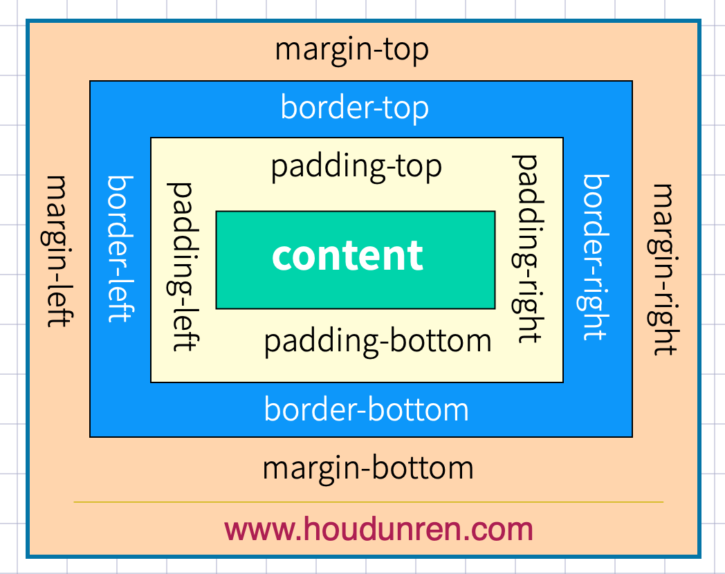
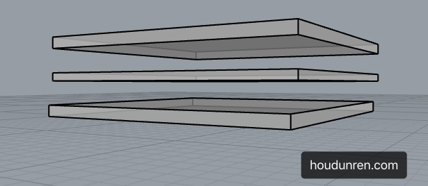
盒子模型
2021-02-24 11:47:08
盒子模型
下而是基本使用示例
1 | <style> |
外边距
声明定义
边距顺序依次为:上、右、下、左。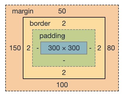
1 | <style> |
下例定义上下 50px 边距,左右80px 边距
1 | margin: 50px 80px; |
下面将边距全部定义为 100px
1 | margin:100px; |
居中设置
margin 设置auto 后,浏览器会自动
1 | <style> |
负值设置
1 | <style> |
边距合并
相邻元素的纵向外边距会进行合并
1 | <style> |
内边距
内边距使用 padding 进行定义,使用语法与 margin 相似。
基本使用
1 | <style> |
BOX-SIZING
宽度与高度包括内边距与边框。
1 | h2 { |
边框设计
样式选择
1 | 类型 描述 |
一次定义四个边
1 | h2 { |
样式顺序为上、右、下、左,可以分别进行定义
1 | h2 { |
单独设置一边样式
1 | 规则 说明 |
1 | h2 { |
边框宽度
1 | 规则 说明 |
简写规则
1 | 规则 说明 |
设置底部边框
1 | border-bottom: solid 5px red; |
行元素边框
行元素也可以进行边框设置
1 | em { |
圆角边框
使用 border-radius 规则设置圆角,可以使用 px | % 等单位。也支持四个边分别设置。
1 | 选项 说明 |
1 | h2 { |
通过边框绘制圆
1 | div { |
定义不同边
1 | border-radius: 10px 30px 50px 100px; |
行元素绘制圆角
1 | em { |

轮廓线
元素在获取焦点时产生,并且轮廓线不占用空间。可以使用伪类 :focus 定义样式。
- 轮廓线显示在边框外面
- 轮廓线不影响页面布局
线条样式
1 | 值 描述 |
1 | outline-style: double; |
线宽设置
1 | outline-width: 10px; |
线条颜色
1 | outline-color: red; |
组合定义
1 | outline: red solid 2px; |
表单轮廓线
表单默认具有轮廓线,但有时并不好看,使用以下样式规则去除。
1 | input:focus { |
DISPLAY
控制显示隐藏
使用 display 控制元素的显示机制。
1 | 选项 说明 |
行转块元素
1 | a { |
块转为行元素
1 | ul>li { |
行级块使用
1 | a { |
VISIBILITY
控制元素的显示隐藏,在隐藏后空间位也保留。
1 | <style> |
溢出控制
隐藏控制
1 | 选项 说明 |
溢出隐藏
1 | div { |
溢出产生滚动条
不同浏览器处理方式不同,有些直接显示出来,有些在滚动时才显示。
1 | div { |
文本溢出
单行文本溢出
1 | div { |
多行文本溢出控制
1 | div { |
尺寸定义
可以使用多种方式为元素设置宽、高尺寸。
1 | 选项 说明 |
min&max
正文中不希望图片太大造成溢出窗口,也不希望太小影响美观,使用以下代码可以做到约束。
1 | <style> |

fill-available
在chrome 浏览器中使用前缀 -webkit 书写样式。
下面是行块元素可以撑满可用空间后的效果。
1 | <head> |

fit-content
下面是根据内容自动适应宽度,让元素居中显示的效果。
1 | <head> |
min-content
使用min-content 将容器尺寸按最小元素宽度设置。
1 | <head> |
max-content
容器尺寸按子元素最大宽度设置。
1 | <head> |
背景样式
2021-02-24 16:29:35
背景颜色
背景颜色可以使用 rga | rgba | 十六进制 等颜色格式
1 | <style> |
背景图片
可以使用 png| gif |jpeg 等图片做为背景使用
1 | background-image: url(icon-s.jpg); |
背景裁切
1 | 选项 说明 |
1 | background-clip: border-box; |
背景重复
用于设置背景重复的规则
1 | 选项 说明 |
1 | background-repeat: repeat-y |
背景滚动
用于设置在页面滚动时的图片处理方式
1 | 选项 说明 |
1 | background-attachment: fixed; |
背景位置
用于设置背景图片的水平、垂直定位。
1 | 选项 说明 |
居中对齐
1 | background-position: center; |
使用具体数值定义
1 | background-position: 100px 100px; |
背景尺寸
1 | 选项 说明 |
指定数值定义宽高尺寸
1 | background-size: 50% 100%; |
宽度固定高度自动
1 | background-size: 50% auto; |
多个背景
后定义的背景置于底层
1 | background-image: url(xj-small.png), url(bg.png); |
多属性定义
1 | background-image: url(xj-small.png), url(bg.png); |
可以一次定义多个背景图片。
1 | background: url(xj-small.png) left 50% no-repeat, |
组合设置
可以使用一条指令设置背景
1 | background: red url(xj-small.png) no-repeat right 50% fixed; |
盒子阴影
可以使用 box-shadow 对盒子元素设置阴影,参数为 水平偏移,垂直偏移,模糊度,颜色 构成。
1 | box-shadow: 10px 10px 5px rgba(100, 100, 100, .5); |
颜色渐变
线性渐变
激变一般用在背景颜色中使用
1 | background: linear-gradient(red, green); |
渐变角度
1 | background: linear-gradient(30deg, red, green); |
向右渐变
1 | background: linear-gradient(to right, red, green) |
向左渐变
1 | background: linear-gradient(to left, red, green); |
左上渐变
1 | background: linear-gradient(to top left, red, green); |
右下渐变
1 | background: linear-gradient(to right bottom, red, green); |
设置多个颜色
1 | background: linear-gradient(red, rgb(0, 0, 200), green, rgba(122, 211, 100, 0)); |
径向渐变
设置渐变
1 | background: radial-gradient(red, blue, green); |
设置渐变宽度与高度
1 | background: radial-gradient(100px 200px, red, blue, green); |
左下渐变
1 | background: radial-gradient(at bottom left, red, blue); |
右下渐变
1 | background: radial-gradient(at bottom right, red, blue); |
左侧向中心渐变
1 | background: radial-gradient(at center left, red, blue); |
底部向中心渐变
1 | background: radial-gradient(at 50% 100%, red, blue); |
标识位
颜色未指定标识时,颜色会平均分布。
红色与蓝色在50%gc 60%间发生激变。
1 | background: linear-gradient(45deg, red 50%, blue 0%); |

标识位相同时将没有过渡效果
1 | background: linear-gradient(45deg, red 0,red 50%, blue 50%); |

径向标识位绘制小太阳
1 | width: 150px; |
通过在两个颜色间中间点定义过渡位置
1 | background: linear-gradient(45deg, red, 50%, blue); |
渐变重复
下例定义从0到25为蓝色,25px到50px的红色,并进行重复后产生渐变的进度条。
1 | background: repeating-linear-gradient(90deg, blue, 25px, yellow 25px, 25px, red 50px); |

径向重复
1 | width: 200px; |
数据样式
2021-02-24 16:35:45
表格
表格可以非常快速的部署数据,灵活控制表格样式是必要的。表格不能设置外边距。
定制表格
除了使用 table 标签绘制表格外,也可以使用样式绘制。
1 | 样式规则 说明 |
1 | <style> |
表格标题
通过 caption-side 可以设置标题位置,值可以设置为 top | bootom。
1 | <style> |
内容对齐
水平对齐使用 text-align 文本对齐规则
1 | <style> |
垂直对齐使用 vertical-align 处理
1 | 属性 说明 |
1 | <style> |
颜色设置
为表格设置颜色与普通标签相似,可以为 table | thead | tbody | caption | tfoot| tr| td 设置颜色样式。
1 | <style> |

使用选择器设置表格隔行变色
1 | <style> |

边框间距
设置单元格间距,设置间距上下10px ,左右 50px。
1 | table { |
边框合并
默认表格边框间是有间距的,以下示例将边框合并形成细线表格。
1 | table { |
隐藏单元格
1 | <style> |
无边框表格
1 | <style> |
数据表格
可以为表格元素使用伪类控制样式,下例中使用 hover 伪类样式
1 | <style> |

列表
列表符号
使用 list-style-type 来设置列表样式,规则是继承的,所以在 ul 标签上设置即可。
1 | 值 描述 |
隐藏列表符号
1 | ul { |
自定义列表样式
1 | ul li { |
符号位置
控制符号显示在内容外面还是内部
1 | 选项 说明 |
1 | ul { |
组合定义
可以一次定义列表样式
1 | ul { |
背景符号
1 | ul li { |
多图背景定义
1 | <style> |
追加内容
基本使用
使用伪类 ::before 向前添加内容,使用 ::after 向后面添加内容。
1 | a::after { |
提取属性
使用属性值添加内容,可以使用标准属性与自定义属性。
1 | <style> |
通过属性值添加标签提示
1 | a { |
自定义表单
1 | {{<style> |
浮动布局
2021-02-24 17:45:20
浮动布局
float 属性定义元素在哪个方向浮动。以往这个属性总应用于图像,使文本围绕在图像周围,不过在 CSS 中,任何元素都可以浮动。浮动元素会生成一个块级框,而不论它本身是何种元素。
在网站开发中需要一行排列多个元素,使用浮动可以方便实现。下面是使用浮动排列多个元素
FLOAT
使用浮动可以控制相邻元素间的排列关系。
1 | 选项 说明 |
文档流
没有设置浮动的块元素是独占一行的。
浮动是对后面元素的影响,下图中第二个元素设置浮动对第一个元素没有影响
1 | div:first-of-type { |

丢失空间
如果只给第一个元素设置浮动,第二个元素不设置,后面的元素会占用第一个元素空间。
1 | div:first-of-type { |
使用浮动
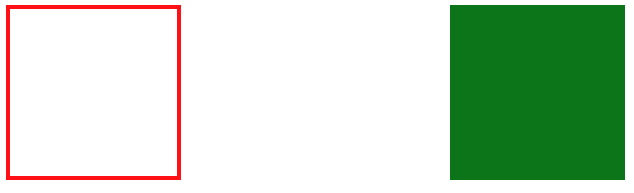
两个元素都设置浮动后,会并排显示
1 | div:first-of-type { |

为第二个元素设置右浮动时将移动到右边
1 | div:first-of-type { |
浮动边界
浮动元素边界不能超过父元素的padding
1 | main { |
浮动转块
元素浮动后会变为块元素包括行元素如 span,所以浮动后的元素可以设置宽高
1 | a { |
清除浮动
不希望元素受浮动元素影响时,可以清除浮动。
CLEAR
CSS提供了 clear 规则用于清除元素浮动影响。
1 | 选项 说明 |
使用清除浮动
1 | <style> |
在父元素内部最后面添加一个没有高度的了元素,并使用 clear:both 。
1 | <style> |
AFTER
使用 ::after 伪类为父元素添加后标签,实现清除浮动影响。
1 | .clearfix::after { |
OVERFLOW
子元素使用浮动后将不占用空间,这时父元素高度为将为零。通过添加父元素并设置 overflow 属性可以清除浮动。
将会使用父元素产生 BFC 机制,即父元素的高度计算会包括浮动元素的高度。
1 | <style> |
页面布局
完成页面布局注意以下几点
- 首先根据设计稿确定页面大小(主要指宽度,移动端不需要考虑),如 1200px 宽度
- 水平分割页面主要区域
- 每个区域中按以上两步继续细分
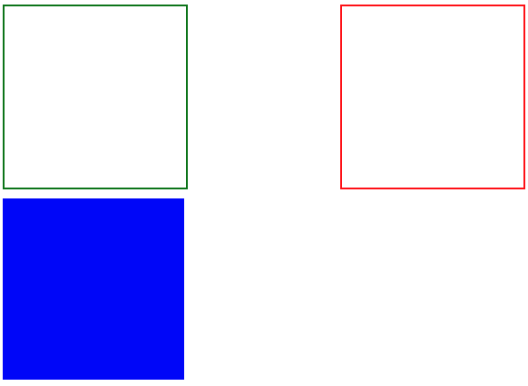
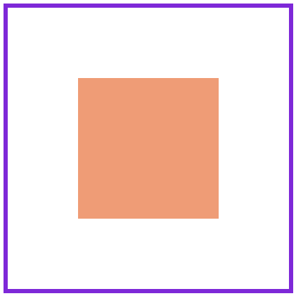
父容器
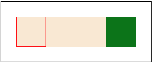
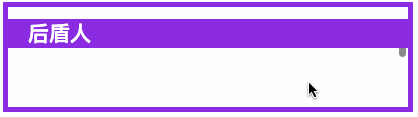
一组浮动元素要放在一个父容器中,如下图绿线指父容器,里面的红线为浮动子元素。
1 | <style> |
形状浮动
通过形状浮动可以让内容围绕图片,类似于我们在word 中的环绕排版。要求图片是有透明度的PNG格式。

距离控制
1 | 选项 说明 |
外边距环绕
1 | <style> |
边框环绕
1 | span.shape { |
显示区域
1 | 选项 说明 |
圆形
1 | span.shape { |
椭圆
1 | span.shape { |
多边形
1 | span.shape { |
内移距离
使用 inset 属性控制环绕向内移动的距离。
1 | span.shape { |
环绕模式
1 | 选项 说明 |
圆形环绕
1 | img { |
椭圆环绕
1 | img { |
图片环绕
1 | img { |
多边环绕
1 | span.shape { |
定位布局
2021-02-24 17:10:51
基础知识
定位的基本思想很简单,它允许你定义元素框相对于其正常位置应该出现的位置,或者相对于父元素、另一个元素甚至浏览器窗口本身的位置。
轮播图是典型的定位应用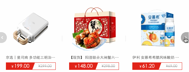
下面弹出的二维码也可以使用定位处理
定位类型
1 | 选项 说明 |
位置偏移
可以为部分类型的定位元素设置上、下、左、右 的位置偏移。
1 | 选项 说明 |
1 | <style> |
使用百分比单位时使用的是父级尺寸,比如下面的示例left:100%会定位到最右边
1 | <style> |

相对定位
相对定位是相对于元素原来的位置控制,当元素发生位置偏移时,原位置留白。
1 | <style> |

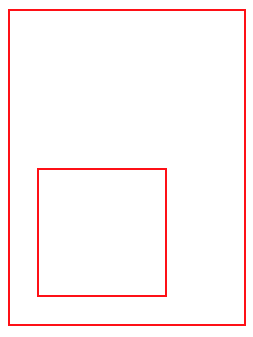
绝对定位
绝对定义不受文档流影响,就像漂浮在页面中的精灵,绝对定位元素拥有行内块特性。
参照元素
如果父级元素设置了 relative | fixed | sticky ,绝对定位子元素将参数此父元素进行定位。
1 | <style> |
默认位置
如果没有为定位元素设置偏移,将受父元素的padding等属性影响。但使用定位一般都会设置偏移位置。
1 | body { |

设置尺寸
可以通过定位的偏移值设置元素的尺寸。
1 | <style> |

居中定位
通过将 left 设置为50% ,并向左偏移子元素宽度一半可以实现水平居中,垂直居中使用方式类似。
1 | <style> |
滚动行为
固定定位元素会随滚动条发生滚动。
1 | <style> |
图标定位
有了绝对定位我们可以很方便的控制元素在任何位置的摆放。
1 | * { |
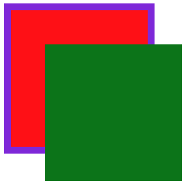
纵向重叠
如果元素重叠在一起,可以使用 z-index 控制元素的上下层级,数值越大越在上面。
父级子元素设置 z-index 没有意义,子元素永远在父元素上面的。
层级改变
1 | <style> |
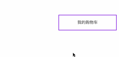
购物车
因为事件捕获特性(请在JS系统课程了解)所要以把父级的 z-index 放在最下面。
1 | <style> |
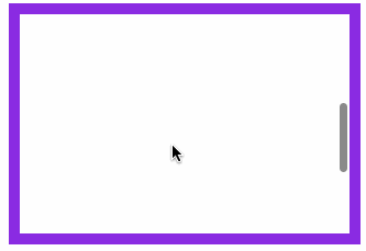
固定定位
元素相对于页面固定定位在某个位置,固定定位元素不会在滚动时改变位置 ,使用 position: fixed 产生固定定位。
1 | <style> |
粘性定位
同级定位
1 | <style> |
非同级定位
不属于同一个父元素设置粘性定位时,后面的元素挤掉原来位置的元素如下例。
1 | <style> |